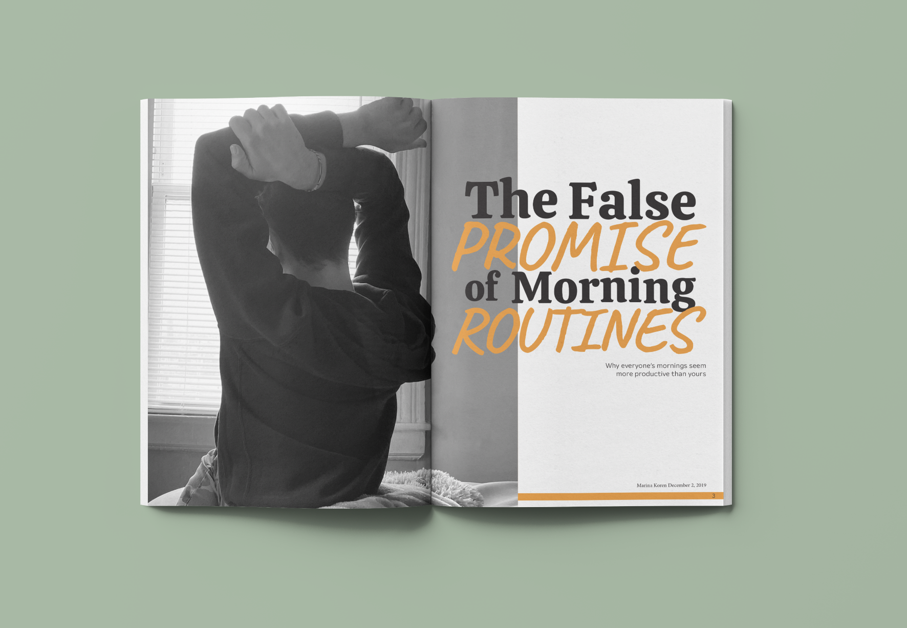
EDITORIAL SPREAD
Challenge:
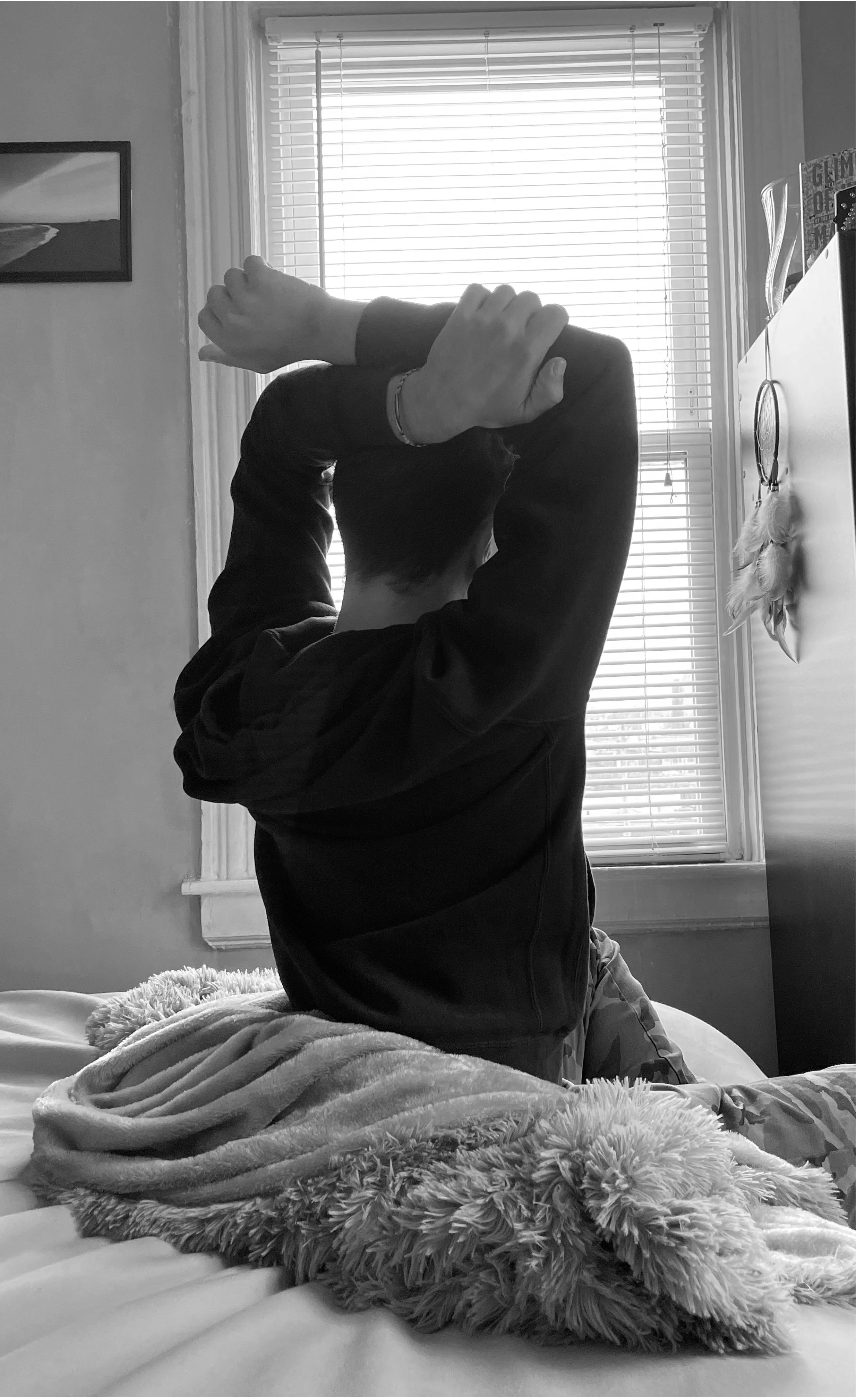
I was challenged to design a unique creative vision by getting the audience to read, linger, and turn the page. When designing I had to demonstrate intentional design decisions, creative use of typography, and a clear understanding of software tools. I was given a list of articles to choose one to design a spread for. The task was to decide to make the spread a two-page spread or a four-page spread. To conceptualize the feel of the article, I had to use original photography. A difficult task with this article was that there was so much content. I knew I did not want to take any out.
Solution:
The article I chose was “The False Promise of Morning Routines.” I decided what would work best with my vision of the article was to design a four spread article. The first two pages was the title page with a main image. The second two pages are the content. To separate all the content I took pictures of what I thought of during a morning routine. For the colors I decided to keep the images black and white with a pop of orange throughout the article.


