THE REMEDY MUSIC
Challenge
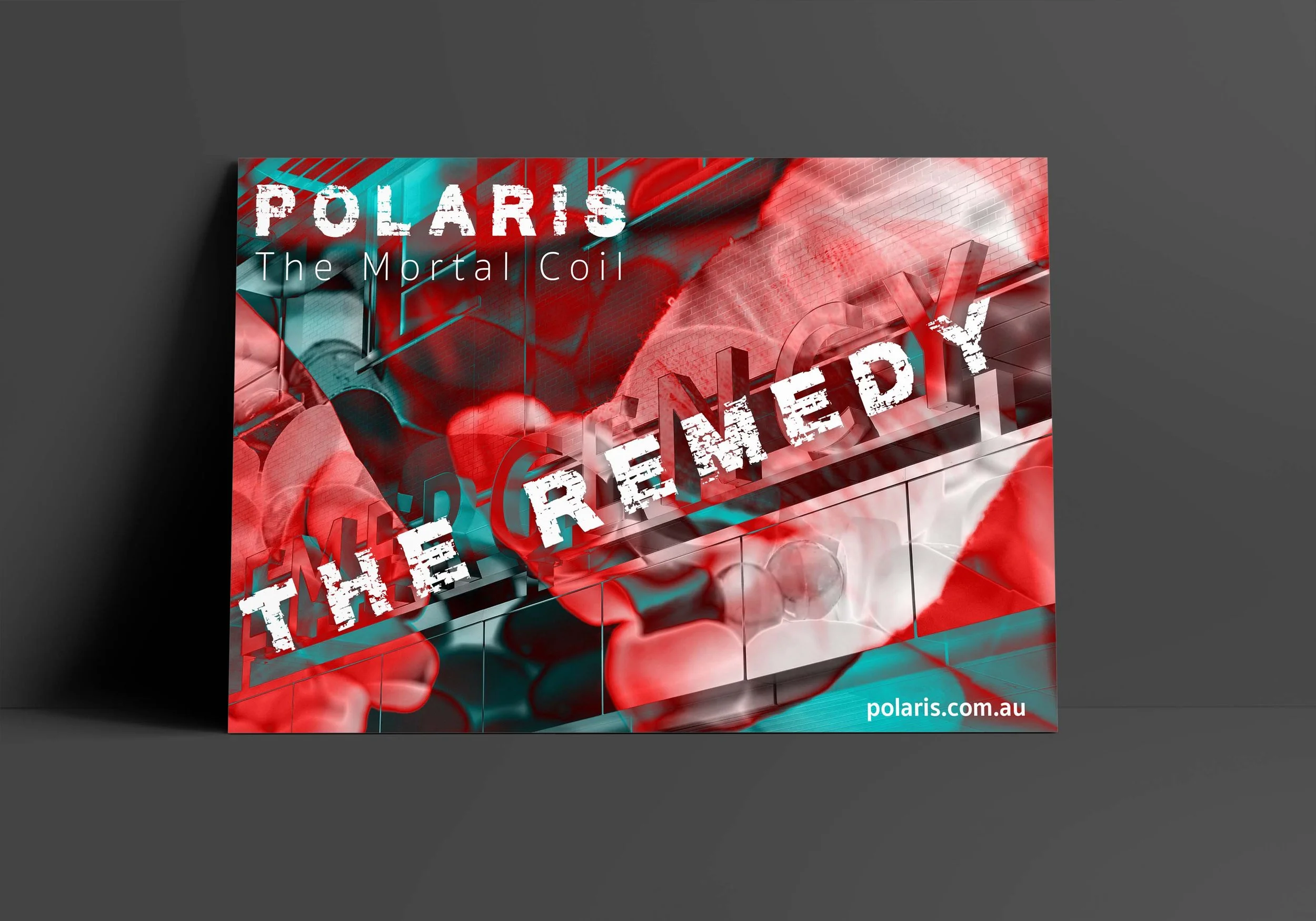
I was tasked to pick a random song and artist out of a hat and design an album cover, single poster, and tour poster for the album. The audience for this design are people who follow the band or the same music genre. An obstacle I had to overcome was listening to music that I do not like a coming up with a design from it. Design is all about stepping away from your style to create a product to represent the client or product.
Solution
I chose song the “The Remedy” by Polaris from the “Motor Coil” album. Polaris is an Australian metal-core band. Hearing the song for the first time, I knew it would be difficult to create a design that would work well with this type of music. I got my inspiration from the band’s previous album cover and the music video for the song. For the album cover and the tour poster, I took “happy” images and destroyed them with multiple blending modes. For the single poster, I focused on the word “remedy” and collected medically themed images. I paired a distressed font with a thin sans-serif font. The person who added “The Remedy” to the hat, said “you really nailed the designs to match the song and type of music.”


