UNITED WAY ANNUAL REPORT
Challenge:
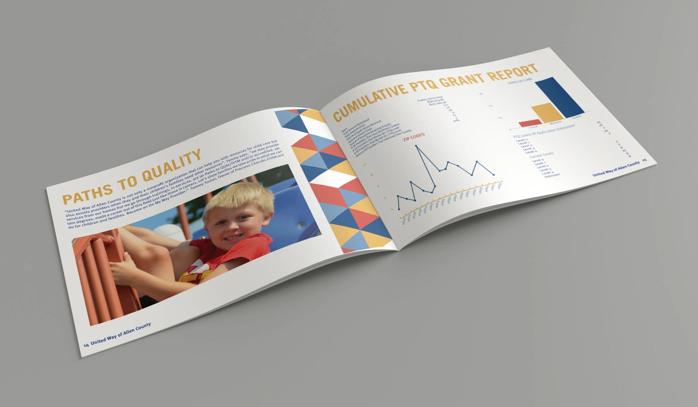
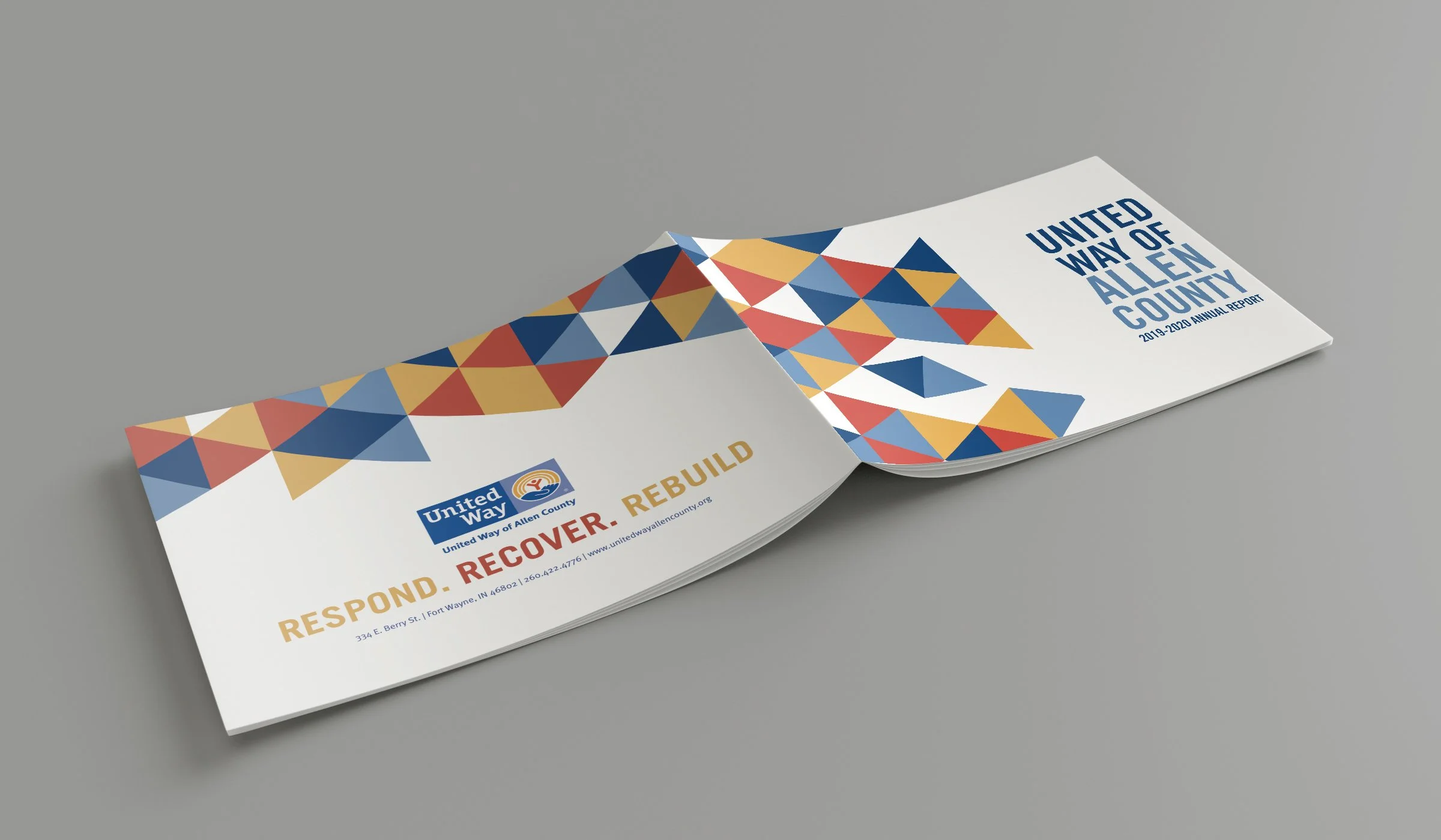
This project was to redesign an annual report. An annual report shows a company’s overall activities and financial performance from the previous year. An annual report should showcase a brand-focused design that is user-friendly. The annual report had to be at least 24 pages. In the report, I had to design a cover, table of contents, vision statement, strategy/performance and outlook, financial highlights, and a back cover. When designing I had to focus on an organized layout that was easy for the audience to read the information.
Solution:
I redesigned an annual report for United Way. The original layout was not terrible, it just needed a few tweaks. My redesign was 28 pages. I decided to spread out the information from the original report to make it more organized. I continued to use United Way’s brand standards. I made a triangle pattern using red, yellow, dark blue, and light blue, that I incorporated throughout the whole report. I used all photography from the original report. I used Illustrator and InDesign to create graphs and charts to make the information legible.


